Prečítate na zariadeniach:

  • Pocketbook
  • Kindle
  • Smartfón či tablet s príslušnou aplikáciou
  • Počítač s príslušnou aplikáciou

Nie je možné meniť veľkosť písma, formát je preto vhodný skôr pre väčšie obrazovky.

Viac informácií v našich návodoch

Prečítate na zariadeniach:

  • Pocketbook
  • Kindle
  • Smartfón či tablet s príslušnou aplikáciou
  • Počítač s príslušnou aplikáciou

Viac informácií v našich návodoch

Prečítate na:

Neprečítate na:

Ako čítať e-knihy zabezpečené cez Adobe DRM?
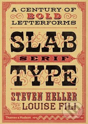
Kniha: Slab Serif Type (Louise Fili a Steven Heller). Thames & Hudson, 2016

Slab Serif Type

A Century of Bold Letterforms

Since being introduced in the 19th century, when they were considered the bastard cousins of more refined serif types, slab serif typefaces have become ubiquitous. Prized for... Čítať viac

Vydavateľstvo
Thames & Hudson, 2016
Počet strán
352

Since being introduced in the 19th century, when they were considered the bastard cousins of more refined serif types, slab serif typefaces have become ubiquitous. Prized for their bold visual impact and versatility, ... Čítať viac

  • Brožovaná väzba
  • Angličtina
Cena: 32,95 €
Na objednávku
Dodanie môže trvať viac ako 30 dní
Tento produkt je na objednávku a jeho dodanie môže trvať aj viac ako 30 dní. Urobíme však všetko pre to, aby sme vašu objednávku odoslali čo najskôr a o jej ceste vás budeme včas informovať.

Naši škriatkovia odporúčajú

Trója padla, Odyseov najväčší boj sa začína. Kniha Odysea, Stephen Fry. Vydavateľstvo Tatran, 2026. Zistiť viac

Viac o knihe

Since being introduced in the 19th century, when they were considered the bastard cousins of more refined serif types, slab serif typefaces have become ubiquitous. Prized for their bold visual impact and versatility, they are used on a broad variety of demonstrative communications, from posters and newspapers to product packaging. In 1931, Morris Fuller Benton created the Stymie typeface, a reworking of a slab serif type popular in Europe at that time: Memphis. The IBM logo is one of the most famous slab serif marks: it began as Stymie and was refined by Paul Rand. Slabs come in many iterations and are recognized as a face with many characters - and nationalities. Following the cult typography volumes Scripts, Shadow Type and Stencil Type, this new volume artfully selects classic examples to present fresh and unexpected typographic ideas. The authors employ their decades of combined experience as art directors to present hundreds of wonderful examples in a visual resource that will delight and inspire today's designers.
Naše katalógové číslo
246598
Počet strán
352
Väzba
brožovaná väzba
Rozmer
180×245 mm
Hmotnosť
1238 g
ISBN
9780500518496
Rok vydania
2016
Jazyk
angličtina
Vydavateľstvo
Thames & Hudson
Kategorizácia

Našli ste chybu alebo škodlivý obsah? Dajte nám, prosím, vedieť!

Nahlásiť chybu alebo škodlivý obsah

Máte o knihe viac informácií ako je na tejto stránke alebo ste našli chybu? Budeme vám veľmi vďační, ak nám pomôžete s doplnením informácií na našich stránkach.

Hodnotenia

5,0 / 5
1
0
0
0
0

Ako sa páčila kniha vám?

Recenzie čitateľov

Dominika
Neoverený nákup
10.2.2017
výborné
Kniha bola určená pre priateľa, ktorý sa zaujíma o rôzne druhy písma. Bol z nej nadšený a ešte stále je. Žiaľ, obálka sa oddelila od stredu knihy, takže to je jediná vada.
reagovať

Dáme si poriadne raňajky. To je lepšie ako všetky reči dokopy.